Discovery & UX Case StudyUX & Product Design · Financial Wellbeing

US Retail
Bank

A US retail bank helping people build healthier financial habits through everyday decisions, without being overwhelming, intrusive or misleading.

Habit FormationFinancial WellbeingAIFinancial ServicesWeb & Native Apps
30
Day habit window
5
Categories
6
Habits
50+
Screens
01 — Research & Insights

Start with Insights

Before designing anything, ten sprint questions framed the problem space, covering the user, the product, the experience over time and the principles that will govern every decision.

Working assumption
US Retail Bank is a retail bank. Its services are available in-store as well digital through its web and native app channel and is targeting existing emerging affluent segment.
Primary research question

How might we help an emerging affluent customer build financial literacy and develop sustainable habits through guidance that feels personal, not prescriptive?


1
Clarity over complexity
Money is where products overwhelm people most, dashboards, jargon, ten metrics competing for attention. Every screen does one job, every insight points to one action. We don't remove the complexity of someone's finances; we hide it until it's needed. A customer should never feel the machinery behind a simple, confident next step.
2
Consistency over intensity
Financial habits compound the way interest does, quietly, over time. So the product rewards showing up, not dramatic gestures. A missed contribution is data, not failure; a small regular saving beats a heroic one-off. The design language reframes slips as part of a long game, because shame is the fastest way to make someone close a banking app and never return.
3
Honest over optimistic
In finance, overclaiming isn't just bad UX, it's a trust and compliance risk. Insights are qualified, confidence is proportional to evidence and the product is explicit about what it isn't: a guide, not a financial advisor. "Based on your last 7 days" earns more trust than "You're on track to save more." Restraint, saying less, more accurately, is the design decision that protects the customer.

Sprint Questions

What do we need to understand before we design? Ten questions frame the problem space.

Q1 — User & Behaviour
Who are we designing for and what is their current relationship with money?
Commit to a primary segment early. Emerging Affluent: Relationship with money is emotional, not rational: shame, avoidance, anxiety and aspiration all shape behaviour more than financial literacy does. Design for the majority's feelings about money, not their spreadsheets.
Q2 — User & Behaviour
What are the key moments in a customer's financial journey where the product can add the most value?
Opening an account and getting set up, through income (getting paid) and obligations (paying bills), to the moment that changes everything: setting a financial goal. From there the emotional arc mirrors any behaviour change, the early progress, the inevitable setback (an overspend, a missed contribution), the progress a customer can finally see and the milestone that proves it was worth it. Setback is where it matters most, it's where financial apps lose people to shame and avoidance, it's where an honest, non-judgmental reframe does the most work.
Q3 — User & Behaviour
What does "genuinely helpful" look like versus intrusive or judgmental — in the context of someone's money?
The test: "Would a trusted, non-judgmental friend say this, or does it feel like a bank looking over your shoulder?" Money surveillance triggers shame and avoidance faster than almost any other data. If a nudge reads as judgment, redesign it.
Q4 — User & Behaviour
What are customers willing to share with an AI about their finances — and what do they need in return to feel safe doing so?
Financial data is more sensitive than health data for many people. The exchange has to feel fair: what's captured, why and what the customer gets back. Transparency about AI's role isn't a compliance checkbox, it's the thing that makes someone willing to share at all.
Q5 — Product & Experience
What financial data does the bank already hold, and what should the product ask the customer to provide?
Day 1 minimum vs. earned-over-time vs. explicitly out of scope. The discipline: ask for the least that makes the guidance useful, because every extra question raises the trust cost.
Q6 — Product & Experience
How does the experience build trust over time — and what prevents false confidence or overclaiming?
Consistency, transparency, honesty, proportional confidence, earned insight. Qualified language ("based on your recent activity" not "you will"), trends not single data points, explicit scope. In finance this isn't just good UX, it's the line between guidance and regulated advice.
Q7 — Product & Experience
How does this fit within the broader banking product — and what does it deliberately not do?
In scope: onboarding, data capture, habit check-in, progress, setback, milestone. Out of scope: real-time financial advice, credit products. The most important line: this is a guide, not a financial advisor and the product must signpost professional help where appropriate.
Q8 — Product & Experience
How does the experience evolve from day 1 to day 30 to month 6 — and what keeps customers coming back?
Onboarding → data capture → first habit forming → setback reframe → 30-day milestone → the compounding story. The arc must feel like genuine progress toward the customer's own goal, not engagement for its own sake.
Q9 — Design & Delivery
What is the minimum viable happy path — and which screen deserves pixel-precise craft?
The screens that carry the emotional weight (e.g. the check-in and the setback state), where conversational UX, data visualisation and honest framing all meet in one surface.
Q10 — Design & Delivery
What principles govern every decision — and how do we know if we've succeeded?
Clarity over complexity / Consistency over intensity / Honest over optimistic: every design decision traces to one. And success criteria: what evidence would tell us this is worth building?

Who are we designing for?

Five personas across the customer spectrum. Amara is the primary ICP — the largest and most designable audience.

AO
Primary ICP
Amara O.
The Aspiring Builder — 34, Senior Account Manager · Segment: Emerging Affluent
GoalBuild financial habits that compound over time, not a dramatic overhaul, just consistent progress toward feeling secure.
MotivationWants to feel in control of her money. Started thinking seriously about the future after a friend's redundancy. Values evidence over hype and hot tips.
NeedsSimple, structured guidance. Progress she can actually see. A product that meets her where she is, not where it assumes she should be.
Pain pointsStarts strong on a budget, loses momentum after a few weeks. Overwhelmed by financial data and jargon. Feels guilty rather than motivated when she overspends.
RelationshipEarns well, saves inconsistently. Has a vague goal (a deposit, a safety net) but no plan. Banks digitally, checks her balance more than she'd like to admit, avoids looking when money's tight.
DK
David K.
The Optimiser — 44, Product Lead · Segment: Established Affluent / high-value, at-risk
GoalGrow wealth deliberately, not just save, but optimise across accounts, investments and returns.
MotivationFollows personal-finance thinking (Ramsey, Housel, FIRE communities). Wants to measure and improve everything.
NeedsRich data, trends over time, connected accounts, the reasoning behind any recommendation.
Pain pointsExisting banking apps feel shallow. Can't see savings, spending, investments and goals in one coherent picture.
RelationshipConfident, engaged, multi-account. High-value customer at risk of moving to a challenger bank or wealth platform with better tools.
ER
Elaine R.
The Life Transitioner — 51, Operations Manager · Segment: Re-engaging / high emotional investment
GoalRebuild financial footing after a period of upheaval, divorce, a career change, supporting ageing parents.
MotivationDriven by a specific life milestone. Wants to feel stable and independent again. Reassurance matters.
NeedsA low-intimidation starting point. Human warmth, not a wall of dashboards. Small wins acknowledged.
Pain pointsFeels behind her peers. Doesn't know where to start. Anxious about seeing figures that show how far things have slipped.
RelationshipReturning to active financial management after letting it drift. High emotional investment, becomes deeply loyal if the product helps her find her feet.
JT
Jordan T.
The Present-Focused Spender — 29, Creative Freelancer · Segment: Younger, lower-engagement, referral-prone
GoalEnjoy life now, stay on top of the essentials, not feel anxious about money. Saving matters but isn't the obsession.
MotivationMotivated by experiences and freedom more than net worth. Responds to small, achievable prompts and visible momentum.
NeedsLow-effort engagement. Gentle, well-timed nudges. Flexibility around irregular freelance income.
Pain pointsDrops off when life gets busy. Finance apps feel like homework and judgment. Doesn't connect small daily choices to long-term outcomes.
RelationshipIrregular income, reactive rather than planned. Engaged when the product feels light and non-preachy; churns when it feels like a lecture. Likely to recommend a product he genuinely likes.
NS
Nadia S.
The Discerning Advocate — 40, Finance/Accounting Professional · Segment: High-credibility, high-retention
GoalPractise the disciplined money behaviours she understands professionally. Deeply values sound financial principles.
MotivationSees the consequences of poor financial habits in her work daily. Personally committed to doing it right.
NeedsCredible, accurate guidance. No get-rich-quick framing. Wants to trust the logic behind every recommendation.
Pain pointsFrustrated by finance apps that overclaim or oversimplify. Time-poor. Needs a product that respects her intelligence.
RelationshipOrganised, sceptical, precise. High retention potential, if the product earns her trust, she becomes an advocate who recommends it to friends and family.

Where does financial behaviour actually come from?

Five bodies of evidence on why people manage money the way they do — and what actually changes behaviour. The research foundation for the financial-habit library.

1
The Psychology of Money
Morgan Housel
Financial outcomes are driven more by behaviour than by knowledge or intelligence. How people feel about money — shaped by their own history — matters more than what they know. Doing "reasonable" consistently beats doing "optimal" occasionally.
Design implication: Build for emotion and consistency, not financial literacy.
2
Atomic Habits
James Clear
Behaviour change comes from small, repeatable actions and well-designed environments, not willpower or motivation. Make the desired behaviour obvious, easy, and satisfying; reduce friction for good habits and add it for bad ones.
Design implication: The product's job is to make one good financial habit frictionless and visible.
3
Nudge & Behavioural Economics
Thaler & Sunstein
People are predictably irrational. Defaults, framing, and choice architecture shape decisions more than information does — auto-enrolment into pensions is the classic proof. Small changes in how a choice is presented produce large changes in behaviour.
Design implication: Sensible defaults and honest framing do more than education ever will.
4
Loss Aversion & Present Bias
Kahneman & Tversky
Losses hurt roughly twice as much as equivalent gains feel good, and people systematically over-value the present over the future — which is why saving is hard and overspending is easy.
Design implication: Reframe saving as protection rather than sacrifice, and make future consequences feel present.
5
Financial Shame & Avoidance
Behavioural research on money anxiety
Money is one of the most emotionally charged and least-discussed areas of life. Shame drives avoidance — people stop looking at accounts precisely when they most need to. Judgment closes the app; non-judgment keeps it open.
Design implication: The setback moment must reduce shame, not amplify it — the single biggest differentiator in financial UX.

Financial habit sources

5 sources. 2 layers. Structural habits set the architecture of good finances; behavioural habits make them stick, each grounded in behavioural evidence, with product context.

LayerAreaThe habitBehaviours & habitsEvidenceWhy it works
CoreFoundationSpend less than you earnTrack the gap between income and outgoings. Make the surplus visible without shame.
app: spending overview
Consistency over intensity (Housel)Behaviour beats income — a modest, consistent surplus compounds; occasional heroics don't.
CoreStabilityPay your bills on timeAutomate essentials. Buffer before due dates.
app: reminders, auto-pay
Defaults (Thaler)Removing friction changes behaviour more than willpower ever does.
CoreSafetyHave an emergency fundStart small, automate it, ring-fence it. 1 → 3 → 6 months.
app: goal pot
Loss aversion (Kahneman)Framed as protection from loss, not sacrifice — which is what actually motivates saving.
CoreGrowthStart investingBegin once stable. Small, regular, automated. Time in the market over timing it.
app: goal setting
Present bias (behavioural econ)Making the future feel present overcomes the pull of now.
CoreProtectionProtect yourselfCover catastrophic risks first. Right-size, don't over-buy. Review at life events.
app: coverage check
Honest over optimistic (trust)Name real risk without fear-selling. Proportional confidence, not scare tactics.
CoreOptimisationMake your money workTax efficiency, fees, rebalancing, compounding.
app: portfolio view
Depth for the engaged (Clear)Layer sophistication for those who want it, without overwhelming the majority.
BehaviouralAutomationAutomate the decisionPay yourself first. Set-and-forget transfers. Remove willpower from the loop.
app: automated rules
Defaults & friction (Thaler / Clear)The highest-leverage habit — good behaviour by default doesn't depend on motivation.
BehaviouralAwarenessCheck in without avoidingBuild a regular, low-anxiety habit of looking at your money — even when uncomfortable.
app: gentle check-in
Shame & avoidance researchAvoidance is the core failure mode. People stop looking when they most need to.
BehaviouralRestraintPause before spendingIntroduce friction before non-essential purchases — the 24-hour rule.
app: spend prompt
Present bias (Kahneman)A small delay counters the present-bias pull that drives impulse spending.
BehaviouralPurposeSet a meaningful goalDefine what money is for — not a number, a purpose. Measure progress against it.
app: goal setting
Define your "enough" (Housel)Purpose sustains behaviour where willpower fails.
BehaviouralResilienceRecover, don't abandonTreat an overspend or missed month as data, not failure. Re-engage without shame.
app: setback reframe
Shame & avoidance researchThe setback moment is where products lose people. A shame-free reframe is the biggest differentiator.
Design implication: Financial wellbeing is a behaviour problem, not a knowledge problem. People don't fail with money because they lack information, they fail because money is emotional, the future feels abstract, and shame drives avoidance. So the product's job isn't to educate; it's to make one good habit easy, reframe setbacks without judgment, and build trust through honesty. And because these habits form a hierarchy, you can't optimise investments if you can't pay your bills, sequence matters as much as content: start everyone on a frictionless, shame-free foundation, and layer depth only for those who want it. The single most important rule: never show someone an investing prompt when they're struggling to pay their bills.
Trust Framework

How trust is built

Framing question

How does the experience build trust over time — and what prevents false confidence or misinterpretation when the subject is someone's money?

How trust is built
Consistency
The product behaves predictably. Customers know what to expect from check-ins, nudges and data displays. In finance, unpredictability reads as risk, so no surprises, ever.
Transparency
Be clear about what financial data is being used and why. Explain every recommendation in plain language. Never hide the methodology behind a confident-sounding number.
Honesty
"Based on your last 7 days" is more trustworthy than "You're on track to save 10% more." Confidence must be proportional to evidence. Don't overclaim, especially about money, where a wrong prediction has real consequences.
Progress
Show customers that their data is working for them, not just being collected. Insight must feel earned, not algorithmic and never like surveillance of their spending.
Avoid False Confidence
Language
Use qualifiers: "Based on your recent activity…" not "You will…" Avoid absolute claims about someone's financial future.
Data
Show trends, not single data points. One good month of saving doesn't mean financial recovery. Context matters and one number, stripped of it, misleads.
Scope
Be explicit that this is a financial guide, not a financial advisor. Signpost regulated professional advice where appropriate, the line between guidance and advice is a legal one, not just an editorial one.
Design
Avoid gamification that rewards volume over quality. Badges for logging ten transactions can create false confidence if the underlying financial behaviour hasn't actually improved.

02 — UX & Insights

From problem to opportunity

The experience mapped across time, key moments in the 30-day arc and a clear happy path.

30-day journey map

What a member feels, needs and does at each critical moment.

Stage 01
Open an Account
Day 1
Feel
Motivated, slightly anxious, money is emotional, and starting means facing it.
Need
A clear, welcoming start, not a form. Reassurance that this won't judge them.
Do
Set one financial goal, pick one habit to start, choose a check-in rhythm.
Stage 02
Setting a financial goal
Days 2–7
Feel
Engaged, looking for proof it's working and for permission to believe they can.
Need
Gentle reinforcement without pressure. Early, visible progress.
Do
Complete the first check-ins, see the first small win take shape.
Stage 03
Setback
Day 14
Feel
Guilty after an overspend or a missed contribution, close to quitting, tempted to stop looking.
Need
Empathy, not judgment. A reframe, not a reset. Shame is what closes the app.
Do
Re-engage through a low-friction, shame-free recovery prompt.
Stage 04
Progress
Day 30
Feel
Proud, curious about what's next, the habit is starting to feel like theirs.
Need
Meaningful, honest celebration + a clear next step.
Do
Review the 30-day arc, unlock the next habit or a deeper financial goal.
Stage 05
Compound Progress
Month 6
Feel
More in control, more confident, money feels less like a threat.
Need
The bigger picture, how small habits compound into real financial security.
Do
View progress across multiple habits, see the trajectory toward their goal.
Design implication: The setback moment (Stage 03) is the most under designed moment in financial apps and the most consequential. Money carries shame in a way few other behaviours do, so an overspend or a missed goal is where customers quietly disengage and stop looking. Getting the reframe right, data, not failure, is the product's biggest differentiator.
In scope — v1
Build Better Habits: The core habits and the confidence to go further
See The Big Picture: See income, outgoings and savings in one honest view
Actionable Insights: Turn the picture into clear, relevant next steps
Onboarding & goal setting
Data capture (income, outgoings, savings, account aggregation (open banking), risk tolerance, tax filing)
Data analysis, forecasting & personalised insights
Habit check-in & progress
View / change financial goals
Native app notifications + multi-channel CTAs (app, email, WhatsApp, social media)
Out of scope — v1
Regulated financial advice
Product recommendations / cross-sell
Investments
Tax advice
Social / community features

03 — Habit Library

11 habits across 2 layers

Grounded in behavioural finance and habit science. Structural habits set the architecture; behavioural habits make them stick. Six form the day-one onboarding set, the habits US Retail Bank should offer on day one.


Spend less than you earn — app screen placeholder
1
Spend less than you earn
The foundation of everything. Keep a gap between what comes in and what goes out and make that gap work for you.
Pay your bills on time — app screen placeholder
2
Pay your bills on time
Protect your standing and remove avoidable cost. Automate the essentials so it happens without willpower.
Have an emergency fund — app screen placeholder
3
Have an emergency fund
A buffer between you and a bad month. Start small, build steadily, one month, then three, then six.
Start investing — web experience placeholder
4
Start investing
Once the foundation is secure, put your money to work. Small, regular, automatic, time in the market beats timing it.
Protect yourself — brand photography placeholder
5
Protect yourself
Cover the risks that matter, insurance, safety nets, the essentials. Right-sized protection, no fear-selling.
Make your investments work for you — app screen placeholder
6
Make your investments work for you
Efficiency, not just activity. Fees, tax, rebalancing, compounding, the depth that turns good into optimal.

04 — Design System

Tokens & craft

A minimal token set built before any HiFi screen, colour, typography, spacing, radius and components, all calibrated to the US Retail Bank brand.

Colour — brand
Brand Blue (Primary)
#235AE4
CTAs, active states, brand marks
Green
#16A34A
Progress, positive states
Light Blue
#3AA1FF
Secondary accents, highlights
Orange
#FD8130
Warnings, setback states
Red
#EB4646
Alerts, critical states
Background Grey
#F9FAFB
Screen background, canvas
Background
#FFFFFF
Cards, surfaces
Typography — Plus Jakarta Sans
28
type/display · 28px · 700 · -0.03em · streak number, milestone stat
Did you walk today, Maya?
type/heading-lg · 18px · 700 · screen heading
Walk 20 minutes daily
type/heading-sm · 14px · 700 · habit name, card title
Based on your goal: live longer. Each of these habits has strong longevity evidence behind it.
type/body · 12px · 400 · lh 1.6 · insight text
Today's insight
type/eyebrow · 10px · 700 · uppercase · 0.08em
Done it
type/button · 12px · 700 · all button labels
Today · Progress · Habits · Profile
type/nav · 9px · 600 · bottom nav
Spacing — base 4px
space/1 · 4pxIcon-to-label gap, dot gap
space/2 · 8pxBetween label and value
space/3 · 12pxCard internal gap
space/4 · 16pxScreen horizontal padding
space/5 · 20pxBetween habit cards
space/6 · 24pxBetween heading and first block
Button height · 44pxPrimary and secondary CTAs
Nav bar height · 56pxBottom navigation
Ring / avatar · 52pxProgress ring diameter
Dot size · 12pxStreak / arc dots
Radius & border
radius/sm · 4pxBar chart bars
radius/md · 8pxInsight box, stat cards
radius/lg · 12pxHabit cards, goal chips
radius/pill · 24pxButtons, step pill
radius/circle · 50%Streak dots, avatar, ring
radius/phone · 20pxPhone frame outer border
border/default · 1pxHabit cards, insight box
border/selected · 1.5pxSelected habit card, chip
border/divider · 0.5pxSection dividers, nav top
border/dot-miss · 1.5px dashedMissed day dots

Extend the Design System with AI Capabilities

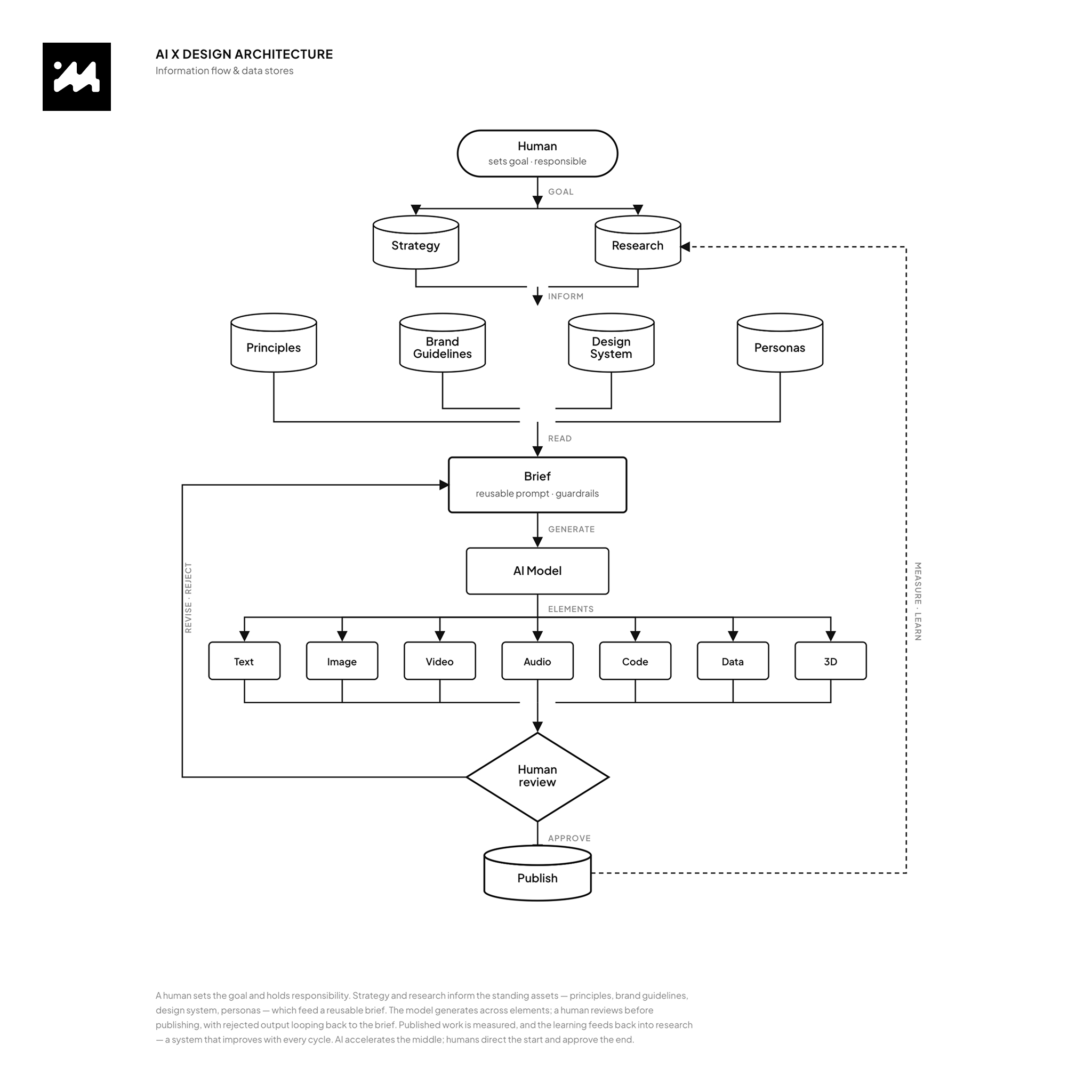
The design system doesn't just govern screens, it governs how AI generates content. By encoding the brand, principles and audience into a reusable brief, every AI-produced asset, copy and photography, comes out on-brand, on-tone and honest by default. The system becomes the guardrail that lets AI scale content production without drifting.
Photography

The photography answers one question: does this look like a real person's financial life, or a stock-photo fantasy of wealth? The direction is grounded, diverse and quietly aspirational, never the yacht-and-champagne cliché of finance marketing.

Real moments, not staged success. Genuine emotion — the relief of a goal reached, the focus of someone planning — over polished perfection.
People across the whole spectrum. Age, ethnicity, profession and life stage represented honestly, matching the persona range from emerging affluent to life-transitioner.
Warm, natural light. Approachable and human, not the cold blue of corporate banking.
Money as life, not numbers. A house, a family, a business, a field, a first flat — what the money is for, not the money itself.
The grade
Bright, natural and true to life, this is what makes a varied set feel like one honest brand. Clean daylight, real colour, gentle warmth in the skin tones. The opposite of a heavily-filtered ad.
Tonal ramp
Shadow
#3A3229
soft warm brown, never crushed black
Mid-low
#7A6A54
Mid
#B29A78
Mid-high
#D8C4A4
Highlight
#F4EBDC
bright, warm white
Treatment notes
Neutral-to-warm white balance. Open shadows, nothing crushed. Full but soft contrast. Minimal desaturation, so colour stays honest. Skin tones warm and healthy across every ethnicity; greens and daylight kept natural. Images should read as a real, well-lit moment — not a graded campaign. Trust comes from authenticity: people believe what looks real. The brand blue lives in the UI and logo, so the photography stays natural and human rather than competing with it.
Benefit: photography that builds trust by looking like the customer's actual life.
Outcome: an image library that feels honest and inclusive, reinforcing "guide, not salesman" before a single word is read.

Tone of Voice

The system plugs four inputs into every AI content brief: the design system (visual rules), brand guidelines (voice and identity), the three principles (clarity, consistency, honesty) and the ICP (Emerging Affluent). From that brief, AI generates both copy and photography direction, consistent, on-brand and honest by construction.


The flow
01 — Input
The four sources set the guardrails.
02 — AI Brief
The combined constraints become a reusable prompt.
03 — Generation
Text and image direction produced at speed.
04 — Human-in-the-loop
A person validates tone, accuracy and honesty before anything ships — the same restraint principle, applied to content.
Benefit: faster, cheaper content production without losing brand coherence or drifting.
Outcome: a design team that uses AI to scale content while the system guarantees it stays on-brand.

05 — Visual Design

High-fidelity screens

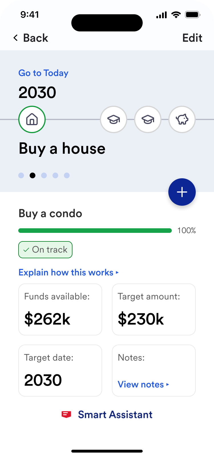
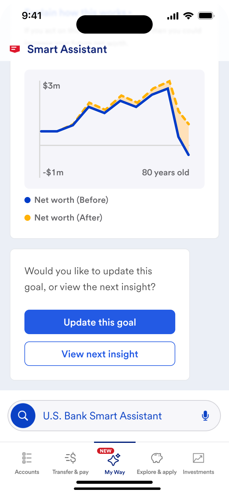
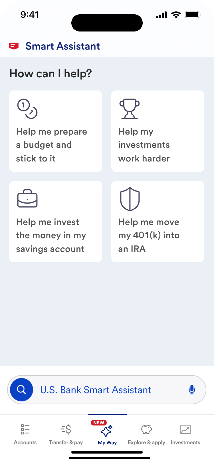
AI woven through the experience, not bolted on. Each screen applies the same discipline: one clear action, evidence-based framing, and language that guides rather than advises. Together they trace the arc from an open question, to a concrete goal, to a personalised insight, to an honest next step, showing how AI can feel like a trusted guide rather than a dashboard to decode.

Web experience

The web channel — the same guidance discipline at desktop scale.

US Retail Bank — web experience

Native app

The native app experience — one clear action per screen, honest framing throughout.
US Retail Bank — native app screen 1
US Retail Bank — native app screen 2
US Retail Bank — native app screen 3

Evaluation & Validation with User Testing

Concept validation was the whole point of Discovery: to produce evidence for build, not just designs. Two rounds of targeted testing with the primary segment pressure-tested whether the experience was usable, whether customers understood it and whether it earned their trust. The findings de-risked the build decision with real signal, not assumption.

Benefit: build decisions grounded in evidence, not opinion.
Outcome: a validated concept the client could invest in with confidence — the tangible deliverable of the engagement.

Research Questions

Two rounds of targeted testing, structured around three question sets.

Usability tasks
Can they do it?
"Set up your first financial goal." (tests onboarding)
"Check how you're progressing toward that goal." (tests the core loop)
"You've overspent this month, show me what you'd do next." (tests the setback moment)
"Find where the app explains how a recommendation was calculated." (tests transparency)
Comprehension tasks
Do they understand?
"In your own words, what is this product telling you here?" (tests insight clarity)
"What does this progress screen say about how you're doing?" (tests honest framing, do they read it accurately, or over-optimistically?)
"Is this giving you advice, or guidance? What's the difference to you?" (tests the guide-not-advisor line, critical for trust and compliance)
Trust / Perception
Do they believe it?
"Does this feel like it's on your side, or selling to you?"
"Would you trust this with your financial information? What would make you trust it more?"
"Does anything here feel like it's overclaiming or promising too much?"